Author: Ed Nelson
Department of Sociology M/S SS97
California State University, Fresno
Fresno, CA 93740
Email: ednelson@csufresno.edu
Note to the Instructor: This exercise uses the 2014 General Social Survey (GSS) and SDA to explore how to compare correlations. SDA (Survey Documentation and Analysis) is an online statistical package written by the Survey Methods Program at UC Berkeley and is available without cost wherever one has an internet connection. The 2014 Cumulative Data File (1972 to 2014) is also available without cost by clicking here. For this exercise we will only be using the 2014 General Social Survey. A weight variable is automatically applied to the data set so it better represents the population from which the sample was selected. You have permission to use this exercise and to revise it to fit your needs. Please send a copy of any revision to the author. Included with this exercise (as separate files) are more detailed notes to the instructors and the exercise itself. Please contact the author for additional information.
I’m attaching the following files.
- Extended notes for instructors (MS Word; .docx format).
- This page (MS Word; .docx format).
Goals of Exercise
The goal of this exercise is to explore how to compare correlations. The exercise also gives you practice using COMPARISON OF CORRELATIONS in SDA.
Part I – Getting Started
We’re going to use the General Social Survey (GSS) for this exercise. The GSS is a national probability sample of adults in the United States conducted by the National Opinion Research Center (NORC). The GSS started in 1972 and has been an annual or biannual survey ever since. For this exercise we’re going to use the 2014 GSS. To access the GSS cumulative data file in SDA format click here. The cumulative data file contains all the data from each GSS survey conducted from 1972 through 2014. We want to use only the data that was collected in 2014. To select out the 2014 data, enter year(2014) in the Selection Filter(s) box. Your screen should look like Figure 13.2-1. This tells SDA to select out the 2014 data from the cumulative file.
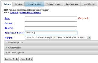
Figure 13.2-1
Notice that a weight variable has already been entered in the WEIGHT box. This will weight the data so the sample better represents the population from which the sample was selected.
The GSS is an example of a social survey. The investigators selected a sample from the population of all adults in the United States. This particular survey was conducted in 2014 and is a relatively large sample of approximately 2,500 adults. In a survey we ask respondents questions and use their answers as data for our analysis. The answers to these questions are used as measures of various concepts. In the language of survey research these measures are typically referred to as variables. Often we want to describe respondents in terms of social characteristics such as marital status, education, and age. These are all variables in the GSS.
In a previous exercise (STAT11S_SDA) we considered different measures of association that can be used to determine the strength of the relationship between two variables that have nominal or ordinal level measurement (see exercise (see STAT1S_SDA). In this exercise we’re going to look at two different measures that are appropriate for interval and ratio level variables. The terminology also changes in the sense that we’ll refer to these measures as correlations rather than measures of association.
Part II - Pearson Correlation Coefficient
The Pearson Correlation Coefficient (r) is a numerical value that tells us how strongly related two variables are. It varies between -1 and +1. The sign indicates the direction of the relationship. A positive value means that as one variable increases, the other variable also increases while a negative value means that as one variable increases, the other variable decreases. The closer the value is to 1, the stronger the linear relationship and the closer it is to 0, the weaker the linear relationship.
The usual way to interpret the Pearson Coefficient is to square its value. In other words, if r equals .5, then we square .5 which gives us .25. This is often called the Coefficient of Determination. This means that one of the variables explains 25% of the variation of the other variable. Since the Pearson Correlation is a symmetric measure in the sense that neither variable is designated as independent or dependent we could say that 25% of the variation in the first variable is explained by the second variable or reverse this and say that 25% of the variation in the second variable is explained by the first variable. It’s important not to read causality into this statement. We’re not saying that one variable causes the other variable. We’re just saying that 25% of the variation in one of the variables can be accounted for by the other variable.
The Pearson Correlation Coefficient assumes that the relationship between the two variables is linear. This means that the relationship can be represented by a straight line. In geometric terms, this means that the slope of the line is the same for every point on that line. Here are some examples of a positive and a negative linear relationship and an example of the lack of any relationship.
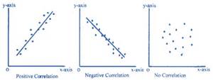
Pearson r would be positive and close to 1 in the left-hand example, negative and close to -1 in the middle example, and closer to 0 in the right-hand example. You can search for “free images of a positive linear relationship” to see more examples of linear relationships.
But what if the relationship is not linear? Search for “free images of a curvilinear relationship” and you’ll see examples that look like this.
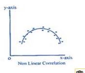
Here the relationship can’t be represented by a straight line. We would need a line with a bend in it to capture this relationship. While there clearly is a relationship between these two variables, Pearson r would be closer to 0. Pearson r does not measure the strength of a curvilinear relationship; it only measures the strength of linear relationships.
Another way to think of correlation is to say that the Pearson Correlation Coefficient measures the fit of the line to the data points. If r was equal to +1, then all the data points would fit on the line that has a positive slope (i.e., starts in the lower left and ends in the upper right). If r was equal to -1, then all the data points would fit on the line that has a negative slope (i.e., starts in the upper left and ends in the lower right).
Let’s get the Pearson Correlation Coefficient for the variables tvhours (i.e., number of hours that respondents watch television per day) and age. The variable tvhours has some extreme values or outliers that we need to eliminate from the data file before computing the correlation. We’re going to define extreme values as any value of 14 or larger. Let’s exclude these individuals by selecting only those cases for which tvhours is less than 14. That way the extreme values will be excluded from the analysis. To do this add tvhours(0-13) to the SELECTION FILTER(S) box. Be sure to separate year(2014) and tvhours(0-13) with a space or a comma. This will tell SDA to select out only those cases for which year is equal to 2014 and tvhours is less than 14. Rerun FREQUENCIES in SDA to get a frequency distribution for tvhours after eliminating the outliers and check to make sure that you did it correctly.
Now we’re ready to get the correlation. Click on CORRELATION MATRIX at the top of the SDA screen and enter the two variables in the dialog box. It doesn’t matter which you enter first. Notice that the SELECTION FILTER(S) and the WEIGHT boxes are filled in. Also notice that SDA has checked the box for the Pearson Correlation which is what we want. Listwise has been selected in the MISSING-DATA EXCLUSION box. That means that any case with missing data for either of these two variables will be excluded from analysis. Your screen should look like Figure 13.2-2. Now click on RUN CORRELATIONS to produce the Pearson Correlations.
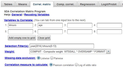
Figure 13.2-2
You should see four correlations. The correlations in the upper left and lower right will be 1 since the correlation of any variable with itself will always be 1. The correlation in the upper right and lower left will both be 0.19. That’s because the correlation of variable X with variable Y is the same as the correlation of variable Y with variable X. Pearson r is a symmetric measure (see exercise STAT11S_SDA) meaning that we don’t designate one of the variables as the dependent variable and the other as the independent variable. The correlation of .19 indicates that you have a weak to moderate correlation in the positive direction. In other words, the older the respondent is, the more television they watch.
Now click on COMP CORREL at the top of the SDA screen. This stands for comparison of correlations. Let’s say we wanted to compare the correlation of tvhours and age for men and for women. In other words, we want to separate the males and the females and get two correlations – one for males and one for females. Enter tvhours and age in the VAR 1: and VAR2: boxes. It doesn’t make any difference which you put in the first and second boxes. Enter sex in the ROW box. The SELECTION FILTER(S) and WEIGHT boxes should still be filled in as before. Notice that SDA will compute the Pearson Correlations. Your screen should look like Figure 13.2-3. Now click on RUN THE TABLE to produce the correlations.
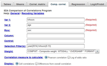
Figure 13.2-3
Notice that the correlations are about the same for males (.22) as for females (.17). Remember not to make too much of small differences.
Now let’s break the data down more finely taking into account sex and race. Sex has two categories – male and female – while race has three categories – white, black, other. If we break our data down by both sex and race we’ll have six categories – white males, black males, white females, black females, other males, and other females. To do this put sex in the ROW box and race in the COLUMN box and rerun the correlations. Now click on RUN THE TABLE to produce the correlations. Now we see more variation in the correlations from -.05 for other females to .29 for white males.
Part III – Now it’s Your Turn
Use SDA to get the Pearson correlation between educ (i.e., respondent’s years of school completed) and speduc (i.e., spouse’s years of school completed). Use CORRELATION MATRIX to get this correlation. Then use COMPARISON OF CORRELATIONS to get the correlation for males and for females. There is no need to select those cases for which tvhours is less than 14 since that variable is not part of this analysis. So delete that from the SELECTION FILTER(S) box. Write a paragraph describing your findings.
Now do the same thing but this time break the data down by both sex and race. Write a paragraph describing your findings.

