Author: Ed Nelson
Department of Sociology M/S SS97
California State University, Fresno
Fresno, CA 93740
Email: ednelson@csufresno.edu
Note to the Instructor: This exercise uses the 2014 General Social Survey (GSS) and SDA to explore graphs and charts for frequency distributions. SDA (Survey Documentation and Analysis) is an online statistical package written by the Survey Methods Program at UC Berkeley and is available without cost wherever one has an internet connection. The 2014 Cumulative Data File (1972 to 2014) is also available without cost by clicking here. For this exercise we will only be using the 2014 General Social Survey. A weight variable is automatically applied to the data set so it better represents the population from which the sample was selected. You have permission to use this exercise and to revise it to fit your needs. Please send a copy of any revision to the author. Included with this exercise (as separate files) are more detailed notes to the instructors and the exercise itself. Please contact the author for additional information.
I’m attaching the following files.
- Extended notes for instructors (MS Word; .docx format).
- This page (MS Word; .docx format).
Goals of Exercise
The goal of this exercise is to explore graphs and charts for frequency distributions. The exercise also gives you practice in using FREQUENCIES in SDA.
Part I – Pie Charts
A pie chart is a chart that shows the frequencies or percents of a variable with a small number of categories. It is presented as a circle divided into a series of slices. The area of each slice is proportional to the number of cases or the percent of cases in each category. It is normally used with nominal or ordinal variables (see exercise STAT1S_SDA).
We’re going to use the General Social Survey (GSS) for this exercise. The GSS is a national probability sample of adults in the United States conducted by the National Opinion Research Center (NORC). The GSS started in 1972 and has been an annual or biannual survey ever since. For this exercise we’re going to use the 2014 GSS. To access the GSS cumulative data file in SDA format click here. The cumulative data file contains all the data from each GSS survey conducted from 1972 through 2014. We want to use only the data that was collected in 2014. To select out the 2014 data, enter year(2014) in the Selection Filter(s) box. Your screen should look like Figure 4-1. This tells SDA to select out the 2014 data from the cumulative file.
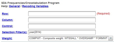
Figure 4-1
Notice that a weight variable has already been entered in the WEIGHT box. This will weight the data so the sample better represents the population from which the sample was selected.
The GSS is an example of a social survey. The investigators selected a sample from the population of all adults in the United States. This particular survey was conducted in 2014 and is a relatively large sample of approximately 2,500 adults. In a survey we ask respondents questions and use their answers as data for our analysis. The answers to these questions are used as measures of various concepts. In the language of survey research these measures are typically referred to as variables. Often we want to describe respondents in terms of social characteristics such as marital status, education, and age. These are all variables in the GSS.
Run FREQUENCIES in SDA for the variables partyid, polviews, and childs. To run the frequency distributions, enter the variable names in the ROW box. Your screen should like Figure 4-2. Separate the variable names by either a space or a comma. Notice that the SELECTION FILTER(S) box and the WEIGHT box are both filled in.
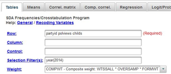
Figure 4-2
Once you have selected the variables, click on the arrow next to CHART OPTIONS and click the arrow next to TYPE OF CHART and select PIE CHART. Click also on the box to SHOW PERCENTS so SDA will print the percents on the pie chart. If you want, you can click on OUTPUT OPTIONS and check the box for SUPRESS TABLE so that SDA will not print out the frequency distribution. Now click on RUN THE TABLE at the bottom. SDA will draw the pie chart for each of these variables. Write a sentence or two for each variable describing the distributions based on these pie charts.
If you are wondering why you shouldn’t use pie charts for variables with a large number of categories, create a pie chart for age and you’ll see why. There are so many categories for the variable age that the pie chart is unreadable. The solution is to combine the various ages into a smaller number of categories. This is called recoding. Let’s divide age into four categories: 18 (the youngest age in the sample) to 34, 35 to 49, 50 to 64, and 65 to 89 (the oldest age in the sample). We can do this be entering the following in the ROW box – age(r:1=18-34 "under 35"; 2=35-49 "35 to 49"; 3=50-64 "50 to 64"; 4=65-89 "65 and older"). (Note: there is no period at the end of the command.)
Note the syntax for the recode statement since you will want to use it later.
- First you enter r: followed by the variable name which is age. The r stands for recode.
- Then you indicate the new value you want to assign to the first category which is 1.
- Then you put the values that you are combining which is 18-34 for the first category. These values must be separated by a dash (i.e., hyphen).
- This is followed by the label you want to assign to this category enclosed in double quotation marks which is “under 35” for the first category. This is free form meaning you can put what you want for the label.
- This is separated from another recoded category by a semi-colon.
- Finally, the entire recode specification is in parentheses.
Enter this into the ROW box and then click on RUN THE TABLE to produce your recoded pie chart for age. Write a sentence or two for this variable describing the distribution based on the bar chart.
Part II – Bar Charts
A bar chart is a chart that shows the frequencies or percents of a variable and is presented as a series of vertical bars. The height of each bar is proportional to the number of cases or the percent of cases in each category. It is normally used with nominal or ordinal variables (see exercise STAT1S_SDA).
Run FREQUENCIES for the variables partyid, polviews, childs, age. Be sure to enter the recode instruction for age. This time click on the arrow next to CHART OPTIONS and click the arrow next to TYPE OF CHART and select BAR CHART. Click also on the box to SHOW PERCENTS so SDA will print the percents on the bar chart. Now click on RUN THE TABLE to produce the bar charts. There is a small problem with childs. One of the categories is “eight or more” children. That means we don’t know what these values actually are. They could be 8 or 10 or 12 or 14 or something else. Since there are so few cases in this category we’re going to ignore this problem.
Write a sentence or two for each variable describing the distributions based on the bar charts.
Part III – Stacked Bar Charts
SDA will also produce what it calls a stacked bar chart. To get a stacked bar chart, click on the arrow next to CHART OPTIONS and click the arrow next to TYPE OF CHART and select STACKED BAR CHART. Now click on RUN THE TABLE to get the stacked bar charts for the variables in Part II. Write a short paragraph describing the stacked bar chart and how it is different from a bar chart. Which do you prefer – bar charts or stacked bar charts? Why?
Part IV – Line Charts
The last kind of chart that SDA will produce is called a LINE CHART. To get a line chart, click on the arrow next to CHART OPTIONS and click the arrow next to TYPE OF CHART and select LINE CHART. Now click on RUN THE TABLE to get the line charts for the variables in Parts II and III. Write a short paragraph describing the line chart and how it is different from the other types of charts. Do you think a line chart is clearer than or not as clear as the other types of charts? Why?
Part V – Conclusions
We have talked about four different types of graphs – pie charts, bar charts, stacked bar charts, and line charts. Are there limitations on when you should use a particular type of chart? Why?

